5 Tricks that Every Marketer Needs to Know to Exploit the New Facebook Page Design
Come March 30th 2012 every active Facebook Fan Page will be flipped over to the new design called The Timeline. Personal Profiles have been using a similar design for some time now. (Pages can choose to push the new design live before that date, but you might want to read the rest of this post before you do so.)
Plenty of posts have been written about all the new features, but I want to point out a few that I think are ripe for marketers.
The obligatory debate rages on about whether or not this format is good or bad for companies, smart marketers are discovering some tweak that need to be made in order to get the most from the new design. (You can get some helpful tips on pages from the Facebook Help page as well)
The Cover Image

The Cover Image dominates the Facebook real estate
The biggest change from a design standpoint is the addition of what Facebook is calling the Cover Image. This 851 x 315 pixel image dominates the head of the page and while this tip isn’t much of a trick as a reality – use this space!
Because the image so dominates the design of the page make sure you send a very strong visual image with this real estate. There are some rules that Facebook is going to enforce, such as no calls to action and no references to “Like” or other Facebook terms.
You will also have the ability to tuck a profile kind of square image (180 x 180) into the cover. The sizes and position of these images are fixed but you can get pretty creative with this space. The main bit of advice is to get an image that says a lot about what your brand is all about.
The About Box

The About tag offers a nice branding opportunity
Down below the Cover Image is the About tab. This box links to the traditional about page that has always existed. However, you now have the ability to dictate what show up on your Facebook homepage in this box.

Edit your about settings to dictate what shows on the about tab
If you’re set up as a local business in your Facebook About settings then the default for the About box is your address and phone. This may be fine, but if you would rather have a tagline and link to your website, then edit your About settings. Keep the text short, about 90 characters including web address, so that it doesn’t fall off the page.
Tab Calls to Action

Create custom calls to action for your other pages and apps
To the right of the About box you’ll see images for all of your current pages and apps or what used to be called tabs. You can now have 12 apps and pages listed and the first four will show up on this bar.
Here’s the cool trick for this one. Now you get to create images for these apps instead of simply using the default app or page images. So now if you want to send someone to a page to grab a free eBook you can use an image to create a call to action. You simply open the page and hit edit settings and then upload a 111 x 74 pixel image that you want to represent your page. You can rearrange the order of the tabs to make the four most important stand out.
The Pin
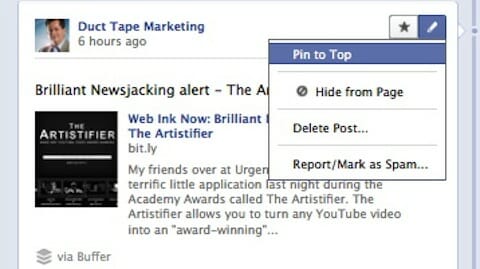
Another way to bring focus to something you are marketing is to pin a story or item to the top of the page. As the admin you can pin a story for up to 7 days and will appear as your top story.
To pin an item you simply click on the edit button to the top right of a story and hit Pin to Top.
The Star
Facebook lines the posts and updates on your page up in two columns. If you want to bring special emphasis to an important post or highlight a product launch you can hit the star in the upper right corner of the update to highlight it.
This makes the post spread across the page and brings special emphasis to it.
Take the time to update these little features today. I’ve seen a traffic spike from Facebook due to some of these more marketing friendly little tweaks.
In the end though it’s still about the content. Make sure you continue to invest in the wall and creating visually and mentally stimulating content.


0 comments:
Post a Comment