7 Blog Design Tips
As a content specialist, I prefer web designs that support content rather than conflict with or ignore it. Web designers should have a real appreciation of content strategybecause it is crucial in launching a successful blog.
For blog design, content issues are particularly important to pay attention to, because, fundamentally, the purpose of a blog is to deliver quality content to a strategically defined audience or community.
For that reason, web design and content must never work at cross-purposes. Here are a few tips for web designers creating weblogs.
1. Design with the Topic, Value Proposition and Audience in Mind
Here are the three main factors that should drive design decisions for a blog:
- What is the blog about?
- What is the blog’s unique value?
- Who is the audience?
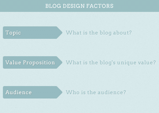
Topic: What is the Blog About?
Obviously, a blog about woodworking should look like a blog about woodworking, not like a blog about parenting.
From a design standpoint, this means creating a website header design that clearly conveys the subject matter, and also selecting imagery, fonts and other design elements that have a woodworking feel about them.
We want the woodworking enthusiast to recognize this is a blog designed for him or her — without having to read a single word. Tweaking standard themes usually isn’t enough to accomplish any of this: a blog with a generic feel won’t inspire visitors to explore the content. If a blog has a high bounce rate, consider punching up the design.
Value Proposition: What is the Blog’s Unique Value?
Once the woodworker grasps the blog is about woodworking — the next question is, "Why should I read this particular blog about woodworking?"
Every blog should have a value proposition. In this case, options include tips for woodworking on a budget, tips for the master craftsman, or tips for the beginner.
Again, the blog’s value proposition should be immediately obvious in the header, and brought out in the texture of the entire design. This is a common weakness in blog design. If there is a value proposition in the header or sidebar at all, it is often overwhelmed by other design elements that compete with it for attention rather than draw attention to it.
Audience: Who is the Audience?
How would the design of a woodworking blog differ depending on whether it was geared to master craftsmen or beginners? A dense design packed with links and information would intimidate a beginner, whereas a master might dismiss a design with a grade-school feel. Using a plain, rectangular cutting board as the header image might attract the beginner, but appall the expert.
The point is to make the target visitors immediately feel at home when they land on the blog. Of course, in order to do this, the designer needs a crystal clear understanding of who the audience is, which comes back to content strategy. As a side note, no amount of design wizardry can compensate for a blog lacking in strategic focus.
2. Pay Attention to Details
With all things, the devil is in the details. Even if we get the big things right, users will have a disappointing experience if the little things are executed improperly. Here are a few design details that I hope you will agree are important to get right.
Author Attribution
Nothing is more off-putting than a blog post authored by "Admin." Blogs are a personal medium: names, and sometimes author thumbnails and bios, are crucial to establishing a human connection.
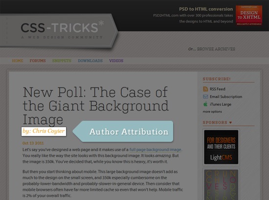 CSS-Tricks displays the author attribution right after the post title.
Internal Search Feature
Users get frustrated if they are looking for something specific and cannot see where to search for it. A surprising number of blogs offer no internal search engine at all, or position it in a place that is harder to find than Atlantis.
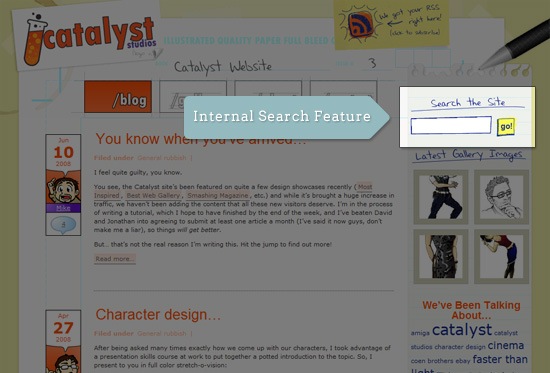 Catalyst Studios has its internal search feature at the top-right of the layout, a common location that users look to for search forms.
Blog Excerpt
Most blog themes provide the ability to display short text snippets of posts on the blog’s home page. Snippet length and formatting should be carefully calculated; when this is not done, the blog can look like the visual equivalent of alphabet soup.
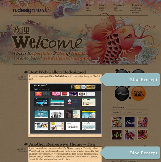 N.Design Studio displays blog excerpts on the home page.
I could go on and on in this vein: seemingly minor features such as clickable titles, prominent "read more" links and image size and style consistency can make or break the blog. The main takeaway is that details are important.
3. Don’t Be Too Unorthodox: Follow Blog Design Patterns
Two places where designers should not flex their creative muscles are social buttons and subscriptions. To get users to follow on Twitter, connect on Facebook, tweet and Like posts and subscribe to the blog, the imagery and positioning of these features must be familiar.
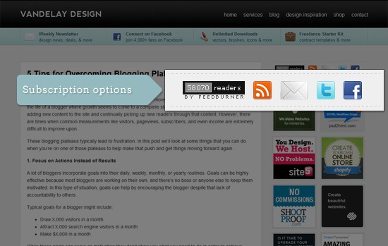 Vandelay Design Blog places subscription buttons at the top-right of the blog layout using recognizable icons.
Joining a blogger’s community should be like buying gum at the checkout counter. If users have to exert effort to join your club, conversions are going to be terrible unless your content is irresistible. But even if it is, why make life difficult? I’ve never yet heard anyone say, "I subscribed to this blog because it had a really unusual RSS button."
Social sharing buttons are tricky. If you display buttons for every social network under the sun, you may wind up confusing the visitor. On the other hand, if you only include a few networks, you may sacrifice powerful shares on networks you don’t display.
As a default, my company includes share buttons for Twitter, Facebook and Google+. If we can identify other social networks that have particular strength with a blog’s audience, we will add them as well.
I like to display share buttons at the top and bottom of the post: some people will share just on the strength of the title and never even read the post; others will read the post thoroughly and be inclined to share at the end if they really like it.
The point is this: There are certain blog design patterns that you should be implementing and maintaining on the site’s design.
4. Have the Sidebar on the Right of the Web Layout
A common blog design pattern is having a section for auxiliary content, containing things such as a short description of the blog, a search form, banner ads, a listing of top blog posts and so on. This is typically a column in the web layout and is usually narrower than the main content area column (to denote visual hierarchy). This section is often referred to as a sidebar (infrequently, it’s also called an aside).
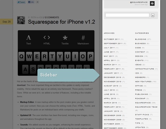 Squarespace’s blog positions the sidebar on the right.
Nothing is quite so vexing to me as a blog whose sidebar is on the left. The natural movement of our eyes is from left to right: if we want visitors to read our blog post, we want their eyes to land on it first. This idea is reinforced by usability studies done by renowned usability expert Jakob Nielsen (e.g. Horizontal Attention Leans Left).
Some bloggers opt for the left sidebar on the theory that it will lead to more ad conversions (because ad banners are typically placed in the sidebar). While monetization is a worthy blogging goal, my belief is that on a blog, ad conversions are earned by enthusiasm for a blog’s content rather than mere positioning of an ad. Putting obstacles in the way of content put obstacles in the way of monetization.
5. Image Placement and Selection Need Serious Consideration
One statement with which writers and bloggers violently agree is that images enhance the appeal of a blog. However, where images are placed makes all the difference.
Best practice is to place images at the top of a post and/or top right. Similar to the sidebar issue, we do not want images to fight with the post for attention. Rather, we want the image to reinforce the message.
Beyond image placement, using (attractively styled) captions with images is an outstanding way to reinforce messaging. Images get more initial reads than text; a strong caption entices a visitor to read the post.
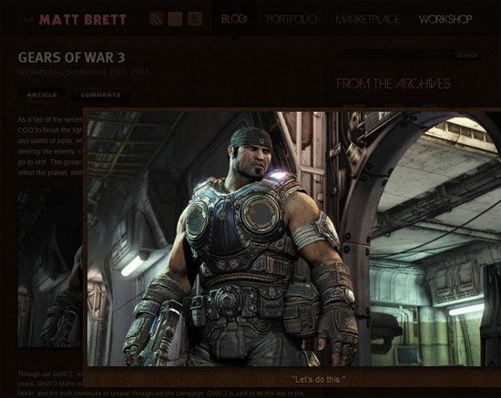 Matt Brett styles his images and captions well on his blog.
Outstanding blogs have a definite strategy behind their image selection. Blogs that appeal to technical folks often rely on annotated screenshots. Blogs that appeal to a more general readership tend to choose images that arouse curiosity or convey a message humorously. Our agency blog has taken the latter route and we’ve gotten very positive feedback from our readers.
Infographics are a fabulous image strategy since they have the potential to become viral. The challenge is the time and effort to create a series of useful and captivating infographics.
6. Put Careful Consideration on Ad Placement
Internet ads are, by nature, interruption marketing. Blogs, on the other hand, are social marketing. Mixing the two is like oil and water.
Make sure you understand your audience before saturating a blog with ads — you could be inviting a nasty backlash. Ongoing split testing of ad layout and positioning is time and money well spent if ad revenue is important. (If it isn’t important — why display ads at all?)
Do not use pop-up ads because they are annoying. Avoid places where ads detract from the content.
Instead, place ads above the post title and on the sidebar. These areas are widely regarded as appropriate for advertising; even "purists" who disdain blog advertising in principle probably won’t be put off, provided, of course, that the content is good.
7. Determine What’s Appropriate: Diary or Magazine Format?
We recently switched our agency’s Internet marketing blog from diary to magazine format. Our decision included the following considerations:
- The blogosphere is saturated with diary-formatted blogs, and we wanted ours to stand out from the crowd.
- In general, our posts are not time-sensitive. Chronology is not especially relevant to our readers.
- We wanted to do away with post snippets altogether, as they looked rather clumsy despite our best efforts. Posts displaying titles only look cleaner in a magazine layout.
- The magazine format gives more emphasis to our images, which we feel are strengths of the blog and motivate visitors to read our posts.
- The magazine format visually separates individual posts more strongly than the diary format, where everything tends to flow together in a continuous stream.
Hopefully our experience will help you discern which format is best for your blog project. Without doubt, there are design solutions to the difficulties we experienced using a diary format, but regardless of which way you go, all of these issues affect readability and must be dealt with somehow.
Conclusion
What I admire about web designers is their ability to convey complex ideas with a simple yet powerful visual. If a designer understands what a post is trying to say, and what a blog in general is trying to say, the design will get the message across — often more powerfully than words.
So I would encourage designers to always ask questions of the client, the blogger, the creative director, the project manager and whoever is involved with shaping the content strategy behind the blog.
If you have doubts about the objective of your design work, the entire success of the blog is in doubt. That’s one thing I’m certain of!

0 comments:
Post a Comment